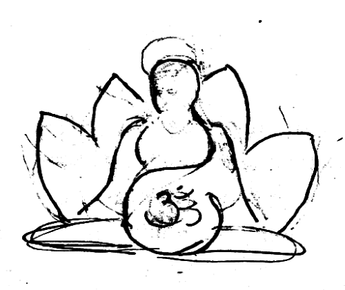
Like many ideas, it came when I was about to fall asleep. One curved line that started at her head and wrapped down around her pregnant belly. I rushed to the kitchen and sketched out the design of a woman sitting in front of a lotus flower that would become the cover of my book. Years later I redesigned the cover. Here’s the story of how both covers came to be.
Original Cover
It started with a simple pencil sketch that I created in a burst of inspiration in about fifteen minutes. I didn’t think of myself as an artist back then, and was surprised to have a visual come to me in that way. The final cover was surprisingly similar to this original sketch.
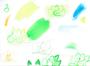
After the sketch I visited the paint store, picked out a few colors of paint and a brush. I tried different colors and configurations on watercolor paper. I wasn’t worried about the lines being perfect, but instead played with color, thickness, and outlines versus filled in flower petals.

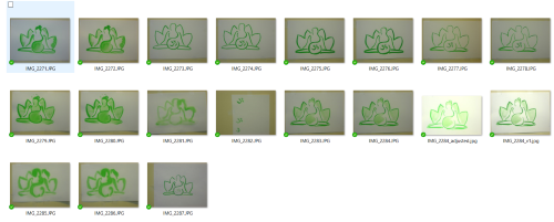
My next painting session included various versions of of green line thicknesses and shading. I taped the original sketch on the window. It was backlit and I put my watercolor paper on top. This allowed me to try the drawing over and over in different styles. At some point a bun was addded to her hair, at the suggestion of my sister who is a true artist and trained in painting.

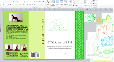
Scanning the painting into a digital format was the next step. I used a high-quailty SLR digital camera to photograph the painting, then cleaned up the lines and contrast in a photo editing software. Soon I began working on the cover layout – font, title, text on the back of the cover, and images. I used MS Publisher to quickly mock up different versions. I printed the cover multiple times, catching spelling mistakes, and folding it to see how it looked. My printer was black and white, and I had to print it in pieces, cut it, and tape it together to get the final effect.
Next I ordered proofs through CreateSpace (now called Kindle Direct Publishing). I chose a matte cover and made sure I followed their template for placement of the white ISBN barcode block and where the spine belonged.


The final cover featured a green painting and a light green spine. As a first-time author and my first self-published book, I was delighted to have my creative cover come to life. I made matching bookmarks and used the cover as a marketing tool.

Cover Redesign
Flash forward several years. I was about to launch the ebook version of the book and wanted to refresh the cover. By this point I’d learned more about marketing and online sales. Knowing that book covers are the number one marketing tool for a book, I made a decision to do a complete redesign.
By this time I was less attached to the creative content of the book, which made it much easier maintain objectivity about what the cover should look like. I researched competative titles and landed on a style and design sense that I thought would help the book get better visibility in the online marketplace, connecting my content to more readers who would love to learn about the topic of yoga and birthing. Even so, I was attached to green, and tried out several concepts where I maintained the green border on the side and bottom of the book.

Only when I totally let go of my attachment to the past cover did a new color scheme emerged, using blue with a contrasting pink font. The final cover more accurately depicted the content within the book, feels polished and has good use of color, spacing, and images. I changed the cover format to glossy and ordered a few rounds of proofs before uploading the final version to KDP. The new book cover was complete!

Summary
I enjoyed the creative process of making my own cover with watercolor, and having my creative vision come to life. I wouldn’t trade that experience for anything. For many years that cover served the book very well and it had an artistic quality that matched the yoga community I was teaching in and connected to at that time. Years later, as a budding book marketer with my own publishing company, the new cover fits with my updated vision for the book, one where I’m working to connect my content to a wider audience and readership.
What are your favorite covers and why? Looking at the last five books you read, what do their covers look like and why do you think you chose those books out? Ping me on Twitter and let me know your thoughts. Twitter: https://twitter.com/tjoneswrites

